|
|
Using the JFC/Swing Packages |
To create a button, you can instantiate one of the many subclasses of theAbstractButtonclass. This section explains the basic button API that
AbstractButtondefines -- and thus all Swing buttons have in common. Because theJButtonsubclass ofAbstractButtondefines little additional public API, this page uses it to show how buttons work.
Note: In Swing 1.0.2, buttons ignore their mnemonics (key accelerators). This bug is fixed in Swing 1.0.3.
The following table shows the Swing-defined
AbstractButtonsubclasses that you might want to use:
Class Summary Where Described JButtonA common button. This section. JCheckBoxA typical check box. How to Use Check Boxes JRadioButtonOne of a group of radio buttons. How to Use Radio Buttons JMenuItemAn item in a menu. How to Use Menus JToggleButtonImplements toggle functionality inherited by JCheckBoxandJRadioButton.Nowhere in this tutorial, but used to implement NumberButtonin the Bingo game.
Note: If you want to collect a group of buttons into a row or column, then you should check out tool bars.
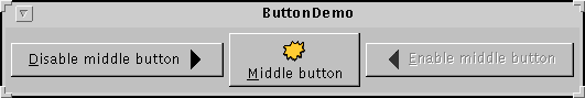
Here is a picture of an application that displays three buttons:
Try this:
- Compile and run the application. The source file is
ButtonDemo.java.
See Getting Started with Swing if you need help.- Click the left button.
It disables the middle button (and itself, since it's no longer useful) and enables the right button.- Click the right button.
It enables the middle button and the left button, and disables itself.
As the
ButtonDemoexample shows, a Swing button can display both text and an image. InButtonDemo, each button has its text in a different place, relative to its image. The underlined letter in each button's text shows the mnemonic -- the keyboard alternative -- for each button.When a button is disabled, the look-and-feel automatically generates the button's disabled appearance. However, you could provide an image to be substituted for the normal image. For example, you could provide gray versions of the images used in the left and right buttons.
How you implement event handling depends on the type of button you use and how you use it. Generally, you implement an action listener
, which is notified every time the user clicks the button. For check boxes you usually use an item listener
Below is the code from
ButtonDemo.javathat creates the buttons in the previous example and reacts to button clicks. The bold code is the code that would remain if the buttons had no images.
//In initialization code:
    ImageIcon leftButtonIcon = new ImageIcon("images/right.gif");
    ImageIcon middleButtonIcon = new ImageIcon("images/middle.gif");
    ImageIcon rightButtonIcon = new ImageIcon("images/left.gif");

    b1 = new JButton("Disable middle button", leftButtonIcon);
    b1.setVerticalTextPosition(AbstractButton.CENTER);
    b1.setHorizontalTextPosition(AbstractButton.LEFT);
    b1.setMnemonic('d');
    b1.setActionCommand("disable");

    b2 = new JButton("Middle button", middleButtonIcon);
    b2.setVerticalTextPosition(AbstractButton.BOTTOM);
    b2.setHorizontalTextPosition(AbstractButton.CENTER);
    b2.setMnemonic('m');

    b3 = new JButton("Enable middle button", rightButtonIcon);
    //Use the default text position of CENTER, RIGHT.
    b3.setMnemonic('e');
    b3.setActionCommand("enable");
    b3.setEnabled(false);

    //Listen for actions on buttons 1 and 3.
    b1.addActionListener(this);
    b3.addActionListener(this);
    . . .
}

public void actionPerformed(java.awt.event.ActionEvent e) {
    if (e.getActionCommand().equals("disable")) {
        b2.setEnabled(false);
        b1.setEnabled(false);
        b3.setEnabled(true);
    } else {
        b2.setEnabled(true);
        b1.setEnabled(true);
        b3.setEnabled(false);
    }
}
The Button API
The following tables list the commonly usedAbstractButtonmethods andJButtonconstructors. You can see most of this API in action by playing with the Buttons pane in theSwingSetexample that's part of the Swing release. See the release's top-levelREADME.txtfor help finding and usingSwingSet.The API for using buttons falls into three categories:
- Setting or Getting the Button's Contents
- Fine Tuning the Button's Appearance
- Implementing the Button's Functionality
Setting or Getting the Button's Contents Method or Constructor Purpose JButton(String, Icon)
JButton(String)
JButton(Icon)
JButton()Create a JButtoninstance, initializing it to have the specified text/image.void setText(String)
String getText()Set or get the text displayed by the button. void setIcon(Icon)
Icon getIcon()Set or get the image displayed by the button when the button isn't selected or pressed. void setDisabledIcon(Icon)
Icon getDisabledIcon()Set or get the image displayed by the button when it's disabled. If you don't specify a disabled image, then the look-and-feel creates one by manipulating the default image. void setPressedIcon(Icon)
Icon getPressedIcon()Set or get the image displayed by the button when it's being pressed. void setSelectedIcon(Icon)
Icon getSelectedIcon()
void setDisabledSelectedIcon(Icon)
Icon getDisabledSelectedIcon()Set or get the image displayed by the button when it's selected. If you don't specify a disabled selected image, then the look-and-feel creates one by manipulating the selected image. setRolloverEnabled(boolean)
boolean getRolloverEnabled()
void setRolloverIcon(Icon)
Icon getRolloverIcon()
void setRolloverSelectedIcon(Icon)
Icon getRolloverSelectedIcon()Use setRolloverEnabled(true)andsetRolloverIcon(someIcon)to make the button display the specified icon when the cursor passes over it.
Fine Tuning the Button's Appearance Method or Constructor Purpose void setHorizontalAlignment(int)
void setVerticalAlignment(int)
int getHorizontalAlignment()
int getVerticalAlignment()Set or get where in the button its contents should be placed. The AbstractButtonclass allows any one of the following values for horizontal alignment:LEFT,CENTER(the default), andRIGHT. For vertical alignment:TOP,CENTER(the default), andBOTTOM.void setHorizontalTextPosition(int)
void setVerticalTextPosition(int)
int getHorizontalTextPosition()
int getVerticalTextPosition()Set or get where the button's text should be placed, relative to the button's image. The AbstractButtonclass allows any one of the following values for horizontal position:LEFT,CENTER, andRIGHT(the default). For vertical position:TOP,CENTER(the default), andBOTTOM.void setMargin(Insets)
Insets getMargin()Set or get the number of pixels between the button's border and its contents. void setFocusPainted(boolean)
boolean isFocusPainted()Set or get whether the button should look different when it has the focus. void setBorderPainted(boolean)
boolean isBorderPainted()Set or get whether the border of the button should be painted.
Implementing the Button's Functionality Method or Constructor Purpose void setMnemonic(char)
char getMnemonic()Set or get the keyboard alternative to clicking the button. void setActionCommand(String)
String getActionCommand(void)Set or get the name of the action performed by the button. void addActionListener(ActionListener)
ActionListener removeActionListener()Add or remove an object that listens for action events fired by the button. void addItemListener(ItemListener)
ItemListener removeItemListener()Add or remove an object that listens for item events fired by the button. void setSelected(boolean)
boolean isSelected()Set or get whether the button is selected. Makes sense only for buttons that have on/off state, such as check boxes. void doClick()
void doClick(int)Programmatically perform a "click". The optional argument specifies the amount of time (in milliseconds) that the button should look pressed. Examples that Use Buttons
The following examples useJButtonobjects. For examples of using other types of buttons, see the sections for check boxes, radio buttons, and menus. Also see the tool bar section, which describes addingJButtonobjects to aJToolBar.
Example Where Described Notes ButtonDemo.javaThis page. Uses mnemonics and icons. Specifies the button text position, relative to the button icon. Uses action commands. AppletDemo.javaRunning a Swing Applet The same example as on this page, but implemented as an applet. ListDialog.javaHow to Use BoxLayout Implements a dialog with two buttons, one of which is the default button. [PENDING: should mention getRootPane().setDefaultButton(aButton) somewhere on this page.] DialogDemo.javaHow to Make Dialogs Has "Show it" buttons whose behavior is tied to the state of radio buttons. Uses sizable, though anonymous, inner classes to implement the action listeners. ProgressBarDemo.javaHow to Use Progress Bars Implements the action listener with a named inner class.
|
|
Using the JFC/Swing Packages |