|
|
Using Components, the GUI Building Blocks |
This page has general information on what components have in common. It tells you how to add a component to a container. It tells you what functionality components inherit from the Component class. It also tells you how you can change the look and feel of components.How to Add a Component to a Container
As you read on in this lesson, you'll notice code that adds components to containers. This is because for any Component object except a Window to display itself onscreen, you must first add it to a Container object. This Container is itself a Component, and is likely to be added to another Container. Windows such as Frames and Dialogs are the top-level containers; they're the only components that aren't added to containers.The Container
class defines three methods for adding components: a one-argument
add()method and two two-argumentadd()methods. Which one you need to use depends on the layout manager the container is using. You'll learn all about layout managers in a later lesson. Right now, we're teaching you just enough to be able to read the code excerpts in this lesson.The one-argument
add()method simply requires that you specify the component to add. The first two-argumentadd()method lets you add an argument specifying the integer position at which the component should be added. The integer -1 specifies that the container add the component component at the end of the container's list of components (just as the one-argument method does). This two-argument form ofadd()isn't used often, so if you see references to "the two-argumentadd()method", they're almost certainly referring to the second two-argument method, which is described in the next paragraph. The FlowLayout, GridLayout
add()methods.The second argument of the second two-argument
add()method specifies the component to be added. The first argument is a manager-dependent string. BorderLayoutNote: Adding a component to a container removes the component from the container it used to be in (if any). For this reason, you can't have one component in two containers, even if the two containers are never shown at the same time.
What the Component Class Provides
All components except menus are implemented as subclasses of the Component
- Basic drawing support.
- Component provides the
paint(),update(), andrepaint()methods, which enable Components to draw themselves onscreen. See Drawing- Event handling.
- Component defines the general-purpose
handleEvent()method and a group of methods such asaction()that handle specific event types. Component also has support for keyboard focus, which enables keyboard control of components. See Event Handling- Appearance control: font.
- Component provides methods to get and set the current font, and to get information about the current font. See Working with Text
- Appearance control: color.
- Component provides the following methods to get and set the foreground and background colors:
setForeground(Color),getForeground(),setBackground(Color), andgetBackground(). The foreground color is the color used for all text in the component, as well as for any custom drawing the component performs. The background color is the color behind the text or graphics. For the sake of readability, the background color should contrast with the foreground color.- Image handling.
- Component provides the basis for displaying images. Note that most Components can't display images, since their appearance is implemented in platform-specific code. Canvases and most Containers, however, can display images. See Using Images
- Onscreen size and position control.
- All component sizes and positions (except for those of Windows) are subject to the whims of layout managers. Nonetheless, every component has at least some say in its size, if not its position. The
preferredSize()andminimumSize()methods allow a component to inform layout managers of the component's preferred and minimum sizes. Component also provides methods that get or set (subject to layout manager oversight) the component's current size and location.How to Change the Appearance and Behavior of Components.
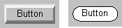
The appearance of most components is platform-specific. Buttons look different on Motif systems than on Macintosh systems, for example.You can't easily change most components' appearance in any major way. You can make some minor appearance changes, such as to the font and background color, by using the appearance-affecting methods and variables provided by a component's class and superclasses. However, you can't completely change a component's appearance even by creating a subclass of the component's class, since most components' platform-specific implementation overrides any drawing the component performs. To change a component's appearance, you must implement a Canvas subclass that has the look you want but the same behavior users expect from the component.
Although you can't easily make a major change to a component's appearance, you can change component behavior. For example, if only numeric values are valid in a text field, you might implement a TextField subclass that examines all keyboard events, intercepting any that aren't valid. This is possible because the platform-independent Component gets to see raw events before its platform-dependent implementation does. See Event Handling
Using Components, the GUI Building Blocks